We released a new landing page for our site a few days ago. As we have more pages and new user-interface elements, it was a great time to think about improving our frontend, targeting the reusability of components and code organization. This post explains how we did that with Phoenix Components and the Atomic Design methodology.
The Reasoning Behind the Choices
There’s a concept in Domain-Driven Design: Tackling Complexity in the Heart of
Software called Ubiquitous Language, which consists of building a common language for developers, domain experts, and other team
members. Its goal is to improve communication between people, helping them understand each other, their
problems, and potential solutions, leading to better software.
Creating a frontend style guide, a collection of reusable patterns and UI components that can be used anywhere in the application, is essential when building a ubiquitous language for any web project. It makes everything consistent across pages and devices. It also boosts the conversation between developers, designers, and product managers because everyone in the room will have the same context when building new things.
There are many tools and methodologies in the market with the intent to help people create a custom style guide. We chose the Atomic Design, by Brad Frost, as the methodology, and Phoenix Components and plain CSS as the tech to build ours. We plan to stick with these three for everything we do at RFP.
Looking at user-interface components as hierarchical pieces make a lot of sense to us, and the reason we decided to go
with Atomic Design. Building complex elements - organisms - from simpler ones - atoms and molecules - is
a great exercise, specially because we need to consider reusability from the beginning. Templates and Pages
aren’t explored yet but will be as we continue evolving the website.
The following quote is a brief description of what Atomic Design is in the words of its author.
Atomic design is a methodology composed of five distinct stages working together to create interface design systems in a more deliberate and hierarchical manner. The five stages of atomic design are: Atoms, Molecules, Organisms, Templates, and Pages.
CSS is a well-known styling language that needs no introduction. Phoenix Components, in turn, are reusable functional components that work in Phoenix templates and LiveViews. Easy to create, build, and maintain. We will see a lot of them in practice in the following sections. Let’s go.
Setting up the Design Tokens
Think of Design Tokens as the attributes of a design. Colors, typography, metrics, transitions… everything related to how a component should look and behave will be a design token. We’re talking about frontend, so you know there are infinite ways to create and use them.
Lucky for us, plain CSS can help. We used CSS Custom Properties for the task, which match our needs perfectly.
:root {
  /* Colors */
  --color-black: #000;
  --color-white: #FFF;
  --color-red: #DC4424;
  --color-gray: #999;
  --color-dark-gray: #1E1E1E;
  --color-light-gray: #F1F1F1;

  /* Typography */
  --font-weight-normal: 400;
  --font-weight-medium: 500;
  --font-family: 'Helvetica Now';

  --font-size-small: 0.875rem;
  --font-size-medium: 1rem;
  --font-size-large: 1.25rem;
  --font-size-xlarge: 1.5rem;
  --font-size-xxlarge: 2.5rem;

  --line-height-small: 1.33;
  --line-height-normal: 1.4;
  --line-height-large: 1.45;
  --line-height-xlarge: 1.5;

  /* Font kits */
  --font-small-normal: normal var(--font-weight-normal) clamp(var(--font-size-small), 0.845rem + 0.129vw, var(--font-size-medium))/var(--line-height-xlarge) var(--font-family);
  --font-medium-normal: normal var(--font-weight-normal) clamp(var(--font-size-medium), 0.939rem + 0.259vw, var(--font-size-large))/var(--line-height-xlarge) var(--font-family);
  --font-xlarge-normal: normal 400 1.5rem/1.33 'Helvetica Now';

  --font-medium-medium: normal 500 1rem/1.5 'Helvetica Now';
  --font-large-medium: normal 500 1.25rem/1.45 'Helvetica Now';
  --font-xlarge-medium: normal 500 1.5rem/1.33 'Helvetica Now';
  --font-xxlarge-medium: normal var(--font-weight-medium) clamp(var(--font-size-xlarge), 1.257rem + 1.036vw, var(--font-size-xxlarge))/var(--line-height-small) var(--font-family);

  /* Metrics */
  --metric-box-sizing: 2.5rem;

  /* Transitions */
  --transition-drawer: all .12s ease-in;
}
Everything in Practice
At first, Atomic Design looks like a step-by-step process. You will start creating the atoms, then group them into molecules, following the same steps over and over until the website is done. After working with it, you realize things won’t be that way.
Let’s start by analyzing the blog_post component from the RFP site to understand how Phoenix components and
Atomic Design work together. By examining how we implemented the component, we can understand how the
methodology and the tech can help on creating a useful style guide.
<.blog_post :for={post <- @posts} resource={post} use_divider?={true}>
  <:heading_block>
    <.post_heading resource={post} as="h2" />
  </:heading_block>

  <:authors_block>
    <.authors data={post.authors} />
  </:authors_block>

  <:cover_block>
    <.post_cover resource={post} />
  </:cover_block>

  <:description_block>
    <.paragraph class="paragraph paragraph--clamped">
      <%= post.description %>
    </.paragraph>
  </:description_block>

  <:reading_time_block>
    <.metadata>
      <.reading_time value={post.reading_time} />
    </.metadata>
  </:reading_time_block>
</.blog_post>
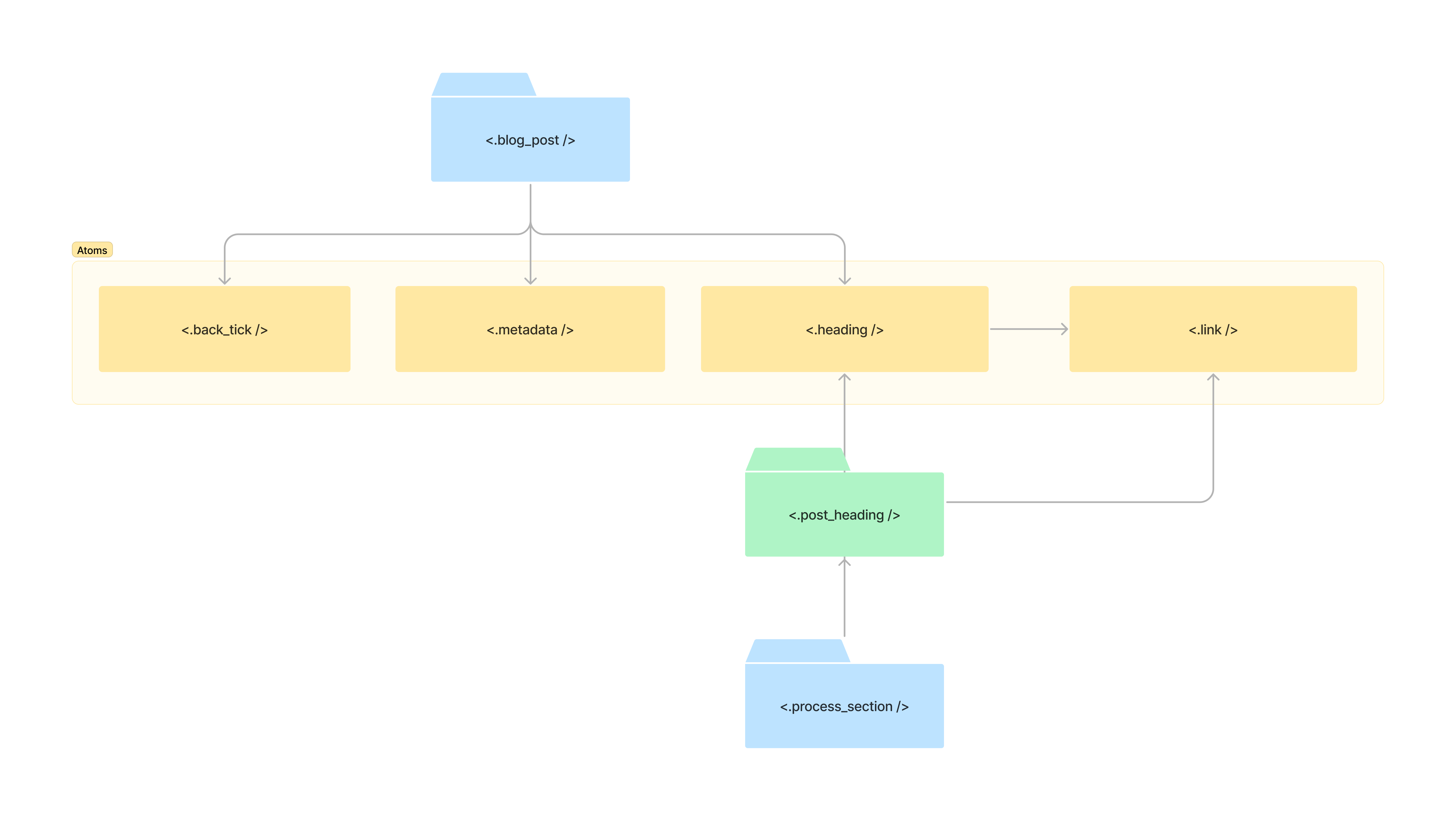
That code lists all the posts we have on our blog. The blog_post organism is composed of reusable
pieces - atoms and molecules - organized in a specific way. The central concept here is how we can build
different organisms by just changing how we wrap those chunks of code.
Slots were substantial to
accomplish the level of reusability we need for our components. Pay attention to the tags starting with <: in
the same code block above. All of them are buckets for content, meaning I can decide which elements to render
or even if I need that block in a given context.
Below, we use the blog_post organism in the post page - the one you are at now. Even though we don’t use the
same slots we did when listing all the posts, we can trust the exact component to accomplish our goal. Thank
you very much, Mr. Slots.
<.blog_post resource={@post} use_back_tick?={true}>
  <:heading_block>
    <.post_heading resource={@post} as="h1" />
  </:heading_block>

  <:authors_block>
    <.authors data={@post.authors} />
  </:authors_block>

  <:cover_block>
    <.post_cover resource={@post} />
  </:cover_block>

  <:body_block>
    <.content_block content={raw(@post.body)} as="section" />
  </:body_block>
</.blog_post>
Let’s dive into how the blog post organism is implemented, from its final form to some of its smaller pieces.
defmodule RFPWeb.CoreComponents.Organisms do
  attr :resource, :map, required: true
  attr :use_divider?, :boolean, default: false
  attr :use_back_tick?, :boolean, default: false
  attr :rest, :global, default: %{class: "blog-post"}
  slot :heading_block, required: true
  slot :authors_block
  slot :cover_block
  slot :reading_time_block
  slot :description_block
  slot :body_block

  def blog_post(assigns) do
    ~H"""
    <article {@rest}>
      <.back_tick :if={@use_back_tick?} path={~p"/blog"} />

      <.metadata>
        <%= format_date(@resource.date) %>
      </.metadata>

      <.stack>
        <%= render_slot(@heading_block) %>
        <%= render_slot(@authors_block) %>
        <%= render_slot(@cover_block) %>
        <%= render_slot(@description_block) %>
        <%= render_slot(@reading_time_block) %>
      </.stack>

      <%= render_slot(@body_block) %>
    </article>

    <.divider :if={@use_divider?} />
    """
  end
end
You can also notice the presence of a global
attribute at line 5,
which allows the usage of default attributes, making our component close to native HTML elements. We use it in
almost all the components we produce. Thanks to it, we can also give default values for the attributes, like
the blog-post class. It’s simple, but it helps us keep the CSS classes organized.
defmodule RFPWeb.CoreComponents.Atoms do
  attr :path, :string, required: true
  attr :rest, :global, default: %{class: "back-tick"}

  def back_tick(assigns) do
    ~H"""
    <.link href={@path} {@rest}>
      <svg
        width="16"
        height="16"
        viewBox="0 0 16 16"
        fill="currentColor"
        xmlns="http://www.w3.org/2000/svg"
      >
        <path d="M16 7H3.83L9.42 1.41L8 0L0 8L8 16L9.41 14.59L3.83 9H16V7Z" fill="currentColor" />
      </svg>
    </.link>
    """
  end
end
The back_tick atom is the back button on the blog post page. Its only required attribute is the path to
navigate when a click happens.
defmodule RFPWeb.CoreComponents.Atoms do
  attr :rest, :global, default: %{class: "metadata"}
  slot :inner_block, required: true

  def metadata(assigns) do
    ~H"""
    <p {@rest}>
      <%= render_slot(@inner_block) %>
    </p>
    """
  end
end
The metadata component is how we display complementary data for a given content, like the reading time of a
post or its publication date. The following is the only CSS rule it needs.
.metadata {
  color: var(--color-gray);
  font: normal var(--font-weight-normal) var(--font-size-medium)/var(--line-height-xlarge) var(--font-family);
}
The heading atom is the last component we will explore before the next section. It is simple yet very
powerful, and it’s used everywhere in the app.
defmodule RFPWeb.CoreComponents.Atoms do
  attr :as, :string, required: true
  attr :rest, :global, default: %{class: "heading"}
  slot :inner_block, required: true

  def heading(assigns) do
    ~H"""
    <%= content_tag(@as, Map.to_list(@rest)) do %>
      <%= render_slot(@inner_block) %>
    <% end %>
    """
  end
end
As we don’t know the level of the heading we need for each page, we’ve added an as attribute, which controls
what HTML tag the component creates. We also use this pattern in other atoms, like the grid and the stack,
which help us write meaningful tags for our content.
In the blog_post organism, we use the heading via the post_heading molecule, which contains the title
and a link to the post.
defmodule RFPWeb.CoreComponents.Molecules do
  attr :resource, :map, required: true
  attr :as, :string, required: true
  attr :rest, :global

  def post_heading(assigns) do
    ~H"""
    <.link href={"/blog/#{@resource.id}"} {@rest}>
      <.heading as={@as}>
        <%= @resource.title %>
      </.heading>
    </.link>
    """
  end
end
Pay attention to how a molecule is simpler than an organism. In our case, it generally groups together simple elements, and doesn’t have a lot of complexity in its implementation.
On the landing page, we wrote about our process, which uses the heading atom in a new
context with a different tag. That content is in an organism called process_section, and this is how it
looks like:

defmodule RFPWeb.CoreComponents.Organisms do
  attr :steps, :list, required: true

  def process_section(assigns) do
    ~H"""
    <.page_section title="Our process" class="page-section process-section" id="our-process">
      <.stack class="stack stack--extra-gap">
        <.grid :for={step <- @steps}>
          <.brand_symbol_outline shape={step.shape} />

          <.stack>
            <.heading as="h3">
              <%= step.title %>
            </.heading>

            <.paragraph>
              <%= step.description %>
            </.paragraph>
          </.stack>
        </.grid>

        <.contact_message />
      </.stack>
    </.page_section>
    """
  end
end
It’s worth mention we noticed an interesting pattern when creating our stylesheets:
- The atoms’ CSS comprises fundamental stuff like typography, colors, and backgrounds. Of course, we will have components of this type with box model styling like margins and paddings, but they are rare;
- Molecules and organisms have CSS rules that control the box model and positioning. Doing this separation of responsibilities increased the reusability points of all of our components.
Organization of components
The final version of Phoenix 1.7 landed, favoring functional components on everything web-related using Tailwind. It’s awesome!
We don’t use Tailwind, as we prefer to create our custom CSS, which is ok. There’s a place in the world for every use case. With that in mind, we’ve adapted some of the things the new version of Phoenix brings. Let’s examine that for a bit.
The framework provides a module called core_components.ex, which contains a bunch of default components used
by its generators. We replaced them with our custom components.

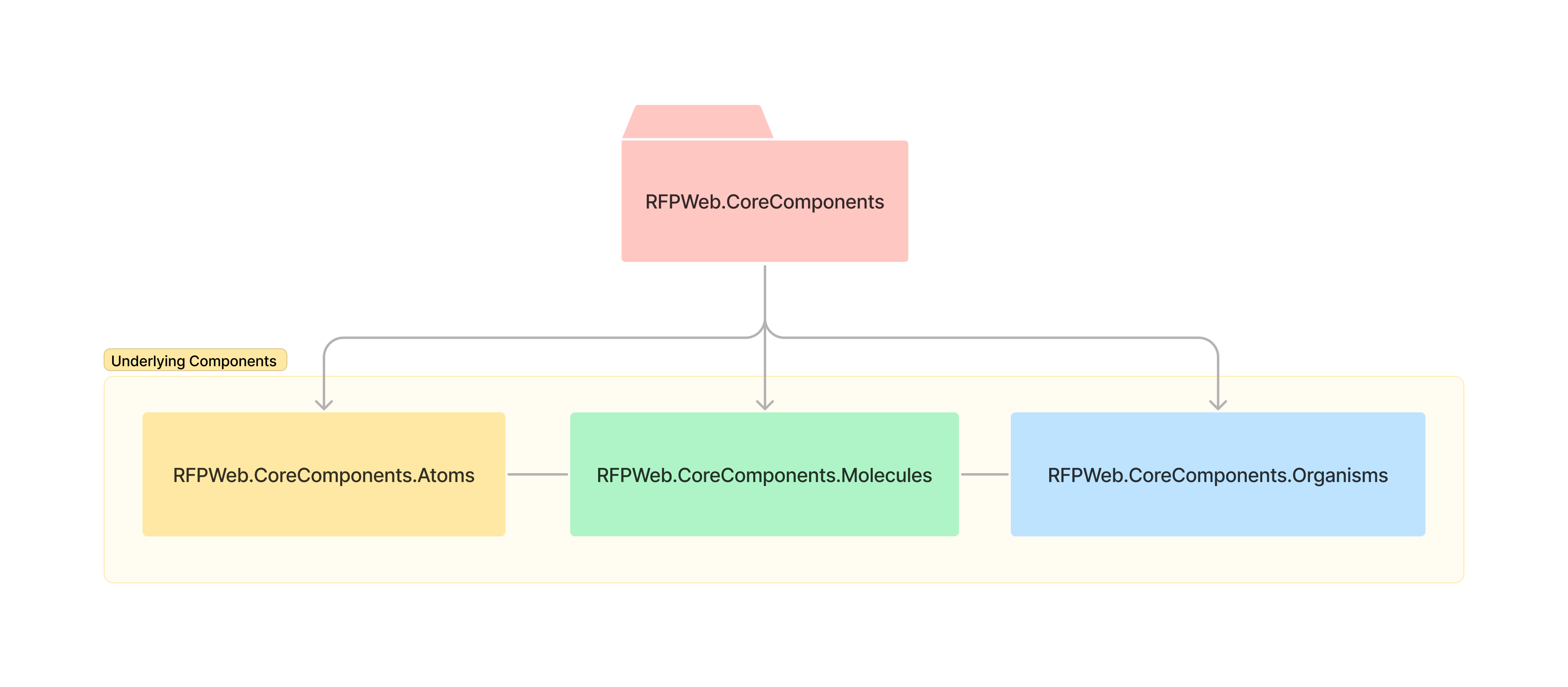
defmodule RFPWeb.CoreComponents do
  alias RFPWeb.CoreComponents.{Atoms, Molecules, Organisms}

  defdelegate heading(assigns), to: Atoms
  defdelegate paragraph(assigns), to: Atoms
  defdelegate metadata(assigns), to: Atoms
  defdelegate grid(assigns), to: Atoms
  # ...

  defdelegate stack(assigns), to: Molecules
  defdelegate post_heading(assigns), to: Molecules
  defdelegate post_cover(assigns), to: Molecules
  defdelegate authors(assigns), to: Molecules
  # ...

  defdelegate blog_post(assigns), to: Organisms
  # ...
end
We’ve used sub-contexts to organize our components internally - one module for atoms, molecules, and organisms. This organization doesn’t matter for the outside but helps us keep things manageable.
Conclusion and next steps
This post scratched the surface of what we can build by combining great concepts.
Functional components in Phoenix are compelling. Associating them with modern CSS and an excellent methodology like Atomic Design, we can keep things productive and organized without all the stress the current frontend landscape has. It’s been a joy to write UI stuff again!
We will continue evolving the website with the things we learn. The priority now is to document every
component with documentation by using ex_docs, and to test everything.
See you in the next post!
